SuperSend Streamlining B2B Outreach

Summary
SuperSend is a B2B SaaS platform that automates outbound email for founders and sales teams. As the product expanded from a self-serve tool into an enterprise-ready platform, the user experience became a bottleneck.
I led a comprehensive redesign to bridge this gap. Our strategy was twofold: we needed to build a "self-serve foundation" robust enough for founders to onboard and launch independently, while simultaneously developing the sophisticated features required by enterprise clients.
Business Objectives
By helping self-serve users to solve their own setup challenges, we aimed to:
-
Decouple Growth from Support: Reduce the Customer Success (CS) burden of answering repetitive
"How do I set this up?" tickets for low-ACV (Annual Contract Value) users. -
Prioritize High-Value Accounts: Free up the CS and GTM teams to focus on white-glove onboarding and managed infrastructure for enterprise clients who pay for a premium, "done-for-you" experience.
Project Goals
-
Activation: Minimize "Time-to-First-Send" for self-serve users through a guided, error-proof onboarding flow
-
Early Value Discovery: Surface "proof of value" early in the 14-day trial (such as reply signals and setup readiness) to drive Trial-to-Paid conversion.
-
Revenue Growth: Transform technical hurdles, like domain and mailbox provisioning, into in-app additional revenue streams.
-
Operational Efficiency: Automate the "deliverability" education process within the UI to protect the CS team’s bandwidth for high-touch enterprise accounts.
The Team & My Role
As the Product UX Designer, I worked directly with the CEO, CTO, and Head of GTM to align our design goals with the company’s pivot toward enterprise-level service.
My end-to-end responsibilities included:
-
Strategic Discovery: Analyzing PostHog session recordings and support tickets to identify churn patterns and pain areas.
-
Facilitation: Leading design and concept workshops with the CEO to align on product vision, and facilitating ideation sessions with the engineering team to ensure technical feasibility and smooth handoffs.
-
Roadmapping: Translating user pain points and business goals into a prioritized product roadmap.
-
Execution: Delivering high-fidelity UI/UX designs and comprehensive handoffs for the engineering teams.
-
Continuous Iteration: Monitoring post-launch data, QA testing and user feedback to refine features in subsequent sprints.
Original SuperSend experience
(at the time we acquired the product)


The Challenge or Why
SuperSend was a powerful engine under the hood, but the "dashboard" was broken. While the product had the technical capabilities for high-volume outreach, it suffered from a "leaky bucket" funnel where potential customers would sign up but never reach the point of value.
Challenge 1: The Activation Gap
Our product analytics (Mixpanel) revealed a significant drop-off: 100+ accounts were inactive, with only a handful of users maintaining a consistent sending volume.
-
A high volume of new users signed up for the free trial but never returned. Most never even created their first campaign. The product was failing to hit the "Aha! moment" before the trial ended.
Challenge 2: Infrastructure Hurdles
In cold outreach, using a primary company domain is a "sin"—users must purchase separate domains to protect their reputation.
-
Users were forced to leave SuperSend, navigate a third-party domain registrar, buy domains and mailboxes, wait until they warm up, and then figure out how to connect it back to us.
Challenge 3: Credibility Gap
As we aimed for enterprise-level clients, our "clunky," legacy UI became a liability.
-
Enterprise customers expect stability and a polished interface. A dated UI creates a "credibility gap" where high-paying clients question the reliability of the underlying technology.
Challenge 4: Support Overload vs. Strategic Growth
The Customer Success (CS) team was stuck in a loop of answering repetitive "How-to" questions for trial users.
-
Every hour spent helping a self-serve user connect a mailbox was an hour lost from high-value enterprise onboarding or outbound sales efforts. We needed to automate the basics to free up the team for strategic growth.
Problem statement
SuperSend’s powerful outbound capabilities were hidden behind a high-friction, "expert-only" interface. This resulted in a "leaky" activation funnel where self-serve users reached a dead end before experiencing the product’s value, while the Customer Success team was forced into manual, repetitive support roles rather than focusing on high-value enterprise growth.
How might we...
-
How might we guide self-serve users through technical setup so they reach their "first send" with total confidence?
-
How might we integrate infrastructure purchasing into the core flow to turn a "dead-end" friction point into a native revenue stream?
-
How might we modernize the UI to meet enterprise standards of trust and stability without losing the simplicity needed for solo founders?
Success criteria for SuperSend
-
Efficiency: Reduce "Time-to-First-Campaign" by streamlining the technical hurdles of mailbox setup.
-
Conversion: Increase the Trial-to-Paid conversion rate by surfacing the product’s value (replies and metrics) earlier in the 14-day window.
-
Monetization: Drive adoption of native paid features, specifically increasing the volume of in-app domain and mailbox purchases.
-
Retention: Lower churn by creating a more "stable" and trustworthy enterprise-grade UI.
-
Deflection: Significantly reduce support ticket volume related to setup confusion, billing, and "Ready to Send" status.
Discovery
I spent 8 weeks analyzing why users were stalling. I looked at their behavior while they were using the platform.
-
I reviewed 100+ PostHog session recordings and analyzed support tickets to identify the exact "moment of frustration" where users gave up and found bugs.
-
I didn't work in a silo. I partnered with Sales, GTM, and Customer Success to cross-reference my findings with feedback from their weekly customer calls and check-ins.
-
I used affinity mapping to organize these pain points, which allowed me to translate messy feedback into a clear, actionable roadmap.
With a long list of potential fixes, I needed a way to decide what to ship first. I used a weighted formula to prioritize tasks:
(Frequency × Severity) + Support Volume
I gave "Extra Weight" to Activation Blockers—anything that prevented a user from performing a core action, such as launching their first campaign, scaling safely, or seeing their first reply.
User Persona 1
User Persona 2
The Solo Founder (Self-Serve)
-
Motivation: "I need to launch a campaign fast and get leads today."
-
Activation: Technical hurdles like DNS, Warm-up, and SMTP settings. If they hit a technical wall, they just churn.
-
Design: Create a "zero-hand-holding" flow.
-
Success Metric: Reducing "Time-to-First-Send" and lowering support tickets for trial users.
The Enterprise SDR Team
-
Motivation: "I need to manage 100+ campaigns, 2 million emails, and report ROI to my manager."
-
Stakes: These are high-paying clients who provide a significant portion of our revenue..
-
Pain Point: At high volume, information becomes "noisy." They need to triage 500+ replies a day without missing the positive leads.
-
Design Goal: Deliver a "Pro-Grade" environment. Focus on high-volume triage (Unified Inbox), team-wide reporting (Performance Page), and consistent UI that builds trust.
Solutions (what shipped v1)
Solution 1: Building a Scalable Foundation (The Design System)
The Problem: The "Credibility Gap"
The legacy UI was inconsistent and "scrappy." For high-paying enterprise clients, this created a lack of trust in our platform’s stability. For the engineering team, the lack of standardized components meant wasting time rewriting code for every new feature.
The Solution: A System-First Approach
I built a unified component library to bridge the gap between design and code. Instead of designing page by page, I created a repeatable framework that ensured a "Pro-Grade" experience across the entire app.
Key Impacts
-
Engineering Velocity: By aligning Figma components with the codebase, we drastically reduced "design-to-dev" handoff time.
-
Enterprise Trust: Modernized the visual language (navigation, tables, and data visualization) to meet the standards of high-value prospects.

I redesigned the signup and login experience. The goal was to break away from 'standard SaaS' aesthetics by integrating a vibrant color palette and custom imagery of the sequence builder.
( See the 'Before' state in the section above: Original SuperSend Experience.)
Solution 2: Guided Onboarding & "Ready to Send" Logic
The Problem: The Invisible Barrier
The legacy platform allowed users to draft campaigns, but the path to actually launching them was a technical "black box." Users had to navigate five disparate pillars—adding leads, connecting mailboxes, writing sequences, setting schedules, and assigning sender profiles—with no clear indication of how they connected. This created a massive backlog of "Why can't I send?" tickets for the Support team.
The Design Intervention: Step-Based Activation
I replaced the fragmented setup with a guided, linear roadmap that turned technical hurdles into a series of clear wins. I collaborated with the Customer Success (CS) team to codify the "Standard of Excellence"—a checklist of what a perfectly configured account looks like.
The Impact
-
Operational Consistency: By creating a "Source of Truth" for the account, we ensured that every user—whether self-serve or enterprise—was set up for deliverability success.
-
Reduced Support Friction: We saw a measurable drop in "Setup Help" tickets, as the UI now proactively answered the questions the CS team used to handle manually.
-
Faster Activation: Users reached the "First Send" milestone with significantly less friction, increasing the likelihood of trial-to-paid conversion.
Solution 3: Turning Friction into Revenue (Native Infrastructure)
The Problem: The "Dead-End" Workflow
In the legacy version, scaling was a DIY nightmare. Because you cannot send cold outreach from a primary domain, users had to leave SuperSend, go to a third-party registrar (like GoDaddy or Namecheap), purchase domains, set up DNS records, warm them up, and manually connect them back to our platform.
The Result
Every time a user needed to scale, we forced them to leave our app. This "dead end" caused a loss of momentum and a significant loss of potential revenue for outside vendors.
The Design Intervention: In-App Provisioning
I designed a flow that allowed users to purchase and provision domains and mailboxes directly within the SuperSend UI. I transformed a complex, 10-step technical process into a "one-click" native experience.
Key Features
-
The "One-Click" Setup: I collaborated with the CTO to design a flow where purchasing a domain automatically handled the backend DNS configuration and mailbox creation.
-
Native Monetization: By embedding the purchase flow directly into the "Add Mailbox" step, we turned a major friction point into a seamless upsell.
-
Batch Provisioning for Enterprise: For high-paying customers who need to buy 100+ domains at once, I designed a bulk-purchase interface that reduced hours of manual work into a few minutes.
Flow 1: Buy Domains
Flow 2: Buy Mailboxes
The Impact
-
New Revenue Stream: This feature quickly became a primary driver of non-subscription revenue, as users overwhelmingly preferred the convenience of native purchasing.
-
Increased Retention: By keeping users inside the platform for their entire setup, we removed the "context switching" that previously led to churn.
-
Support Deflection: By automating the DNS and mailbox setup, we eliminated the #1 source of technical support tickets: "My domain isn't connecting correctly."
Solution 4: The Monetization Engine (Plan Changes & Add-Ons)
The Problem: The "Trial-to-Paid" Friction
The transition from trial to paid was a friction-filled "all-or-nothing" experience. Users often felt blindsided when their trial ended because of a lack of visibility to plan details, and they struggled to find a plan that fit their specific need or compare plans. Crucially, there was no way to purchase "extra" capacity—such as an additional LinkedIn profile - without forcing the user to jump to a significantly more expensive enterprise tier. This rigidity caused "Analysis Paralysis," leading users to either delay their upgrade or churn entirely.
The Design Intervention: Plan Management
I redesigned the billing interface to focus on transparency and flexibility.
Key Features
-
The "Trial-to-Paid": I designed a proactive notification system that alerted users 3 days before their trial expired, providing a clear "path to purchase".
-
Add-Ons: LinkedIn Sender: I introduced a UI that treated LinkedIn profiles as add-ons. This allowed users to "bolt-on" extra LinkedIn capacity to their existing plan for a small fee, rather than being forced into a massive tier jump.
The Impact
-
Reduced Churn: By introducing a persistent billing header and proactive notification system, we gave users 100% visibility into their trial status. Removing the mystery of when the trial would end—and showing exactly which features they would keep—eliminated the "Trial Cliff" and created a smoother psychological transition to a paid subscription.
-
Increased ARPU (Average Revenue Per User): The modular add-on system allowed us to capture incremental revenue from users who needed "just one more" LinkedIn profile, but weren't ready for an Enterprise plan.
-
Self-Serve Growth: We eliminated the need for manual "billing overrides" by the CEO/Sales team, allowing users to customize their own limits directly in the UI.
Solution 5: The 14-Day "Warm-up" Transparency
The Problem: The "Waiting Game" Friction
Cold email success depends on mailbox "warm-up"—a technical process of gradually increasing volume to build sender reputation, which typically takes 14 days. In the legacy UI, this was a silent background process.
The result
Users would connect mailboxes and see no immediate activity. Without front-end feedback, many assumed the tool was broken or "stuck," leading them to bombard CS with questions.
The Design Intervention: Visualizing Momentum
I designed the Warm-up interface to make "idle time" visible as progress. My goal was to educate users about deliverability science while providing the dopamine hit of seeing their account "getting hotter" daily.
Key Features
-
The Growth Visualizer: I added a dynamic growth chart that visualized mailboxes moving from Day 1 to Day 14. By showing the daily "step-up" in volume, I made the backend logic tangible, proving to the user that the tool was actively building their deliverability health.
-
The "Health": I introduced a real-time mailbox health section. This gave users peace of mind that their domain was safe, positioning SuperSend as a "security-first" partner rather than just a software utility.
-
Education as a Feature: I embedded "Why this matters" and "What is Warming" throughout the flow. By explaining why we were limiting their volume (to protect their domain), we turned a perceived limitation into a premium feature.
The Impact
Churn Prevention: By providing visual feedback of the 14-day journey, we kept users engaged during the "waiting period," significantly reducing early-trial drop-off.
Support Deflection: Support tickets asking "Is my warm-up working?" were eliminated, as the UI became the transparent source of truth for account progress.
Solution 6: Multi-Channel Sequence Builder & Branching
The Problem: The "Linear" Limitation
The legacy sequence builder was strictly linear—a simple "Step 1 to Step 2" flow. Users were forced to run simple campaigns, meaning that if a lead didn’t reply to Email #1, they received Email #2.
In the real world, sales are multi-channel and "if/then" based. This limitation made the product feel "small" and restrictive to enterprise teams who needed to coordinate complex, high-touch outreach across email and LinkedIn. Without branching logic, users couldn't execute sophisticated strategies like: "If they accept my LinkedIn request, send a DM; if not, send an Email."
The Design Intervention: The Logic-Based Architect
I redesigned the campaign builder to move from a "List" view to a Conditional Workflow. The goal was to give users "if/then" powers without making the UI feel like a coding environment.
Key Features
-
Visual Branching Logic: I introduced "Conditional Steps." Users could now create branches based on engagement (e.g., "If Email Opened," "If LinkedIn Request Accepted"). I used clear visual nesting to ensure users could see the "path" a lead would take.
-
Multi-Channel Orchestration: I unified Email and LinkedIn actions into a single timeline. This allowed users to "warm up" a lead on LinkedIn (Profile View) before the first Email ever hit their inbox, significantly increasing response rates.
-
The "Safety Brake" (Global Limits): To protect users from getting banned by LinkedIn or Gmail, I designed a global oversight panel within the builder. It warned users if their branched sequence was too aggressive for their current "Warm-up" limits.
The Impact
-
Closing the Enterprise Gap: This was the #1 feature requested by high-value teams. Shipping it allowed the Sales team to move up-market and close larger agency deals that were previously "un-closeable."
-
Increased Product Stickiness: By consolidating Email, LinkedIn, and Twitter into one logical flow, SuperSend became the "Command Center" for the user’s entire sales process, significantly increasing long-term retention.
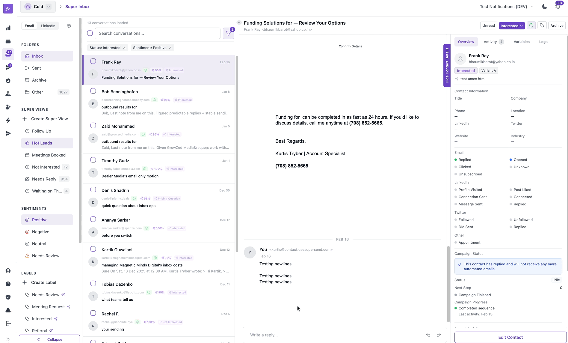
Solution 7: The Unified Outreach Inbox aka Super Inbox
The Problem: Communication Workflows
As SuperSend evolved into a multi-channel platform, a critical bottleneck emerged in response management. Originally, replies were buried within individual campaigns.
The result
A user running 50+ campaigns was forced to switch between dozens of internal campaign views and their LinkedIn DMs just to check whether a lead had responded. This fragmented workflow was a "productivity killer"—replies were easily missed.
The Design Intervention: Centralized Communication Hub
I designed a Unified Inbox that aggregated replies from all channels and mailboxes into a single, high-performance workspace. My goal was to create a "Command Center" where an SDR could handle 100+ conversations without ever leaving the app.
Key Features
-
Multi-Channel Threading: I designed a message interface that unified Email into a single chronological thread. No matter where the conversation started, the history was all in one place.

The Impact
-
From Periodic to Daily Usage: Centralizing the workflow significantly increased Daily Active Users (DAU) and product stickiness.
-
Operational Efficiency: We eliminated the need for users to manually check 50+ campaign views. This "Workflow Consolidation" saved power users hours of manual labor per week.
-
Improved Conversion Rates: By streamlining the response process, we enabled users to reduce response times, resulting in more booked meetings and a higher ROI for their outreach.
Solution 8: Performance Analytics & Data-Driven Insights
The Problem: The "A/B Testing" Blindspot
While users were running dozens of campaigns, they had no way to compare the performance of specific steps or copy across the entire platform. For example, if a user was testing three different "Subject Lines" across 10 different campaigns, they had to manually open each campaign and calculate the winning copy in a spreadsheet. This made weekly team reporting a manual chore and prevented users from quickly identifying and scaling their best-performing messaging.
The Design Intervention: The Step-Level Intelligence View
I designed a centralized Step Performance Dashboard that allowed users to aggregate and compare data at the "copy level" rather than the "campaign level."
Key Features
-
The "Global Default" View: I created a comprehensive "Master View" that aggregated every user and campaign into a single source of truth. This provided managers with instant, high-level visibility into the entire team's health at a glance.
-
Custom Comparative Views: I designed a "View Builder" where users could multi-select specific campaigns (e.g., "Q1 Enterprise Leads" vs. "Q1 SMB Leads") to compare performance side-by-side. This allowed users to isolate variables and see exactly which copy performed best in specific market segments.
-
Streamlined Reporting (Export): I integrated a "One-Click Export" for these custom views. This transformed a multi-hour manual reporting task into a 30-second workflow, allowing SDR managers to bring polished data directly into their weekly leadership meetings.
The Impact
-
Spreadsheet Elimination: By providing a native way to group and compare campaigns, we eliminated the "Manual Data" significantly increasing the time users spent optimizing rather than reporting.
-
Data-Driven Strategy: Users could finally prove which "Step 1" copy was the winner across the entire organization, leading to a standardized, high-performing "Playbook" for the whole sales team.
-
Enterprise Retention: The ability to generate custom, exportable reports made SuperSend an essential part of the enterprise management stack, not just a tool for individual contributors.
Learnings & Shipping V2
1. The Onboarding Pivot: Reducing "Front-Loaded" Friction
The Learning: Based on user feedback and session recordings, we discovered that our V1 onboarding was too demanding. It required a ~30-minute commitment across 6 steps before a user even saw the dashboard. We realized that the only critical early step for a user to feel "activated" was connecting their outbound channels (Email or LinkedIn). Everything else—like importing 1,000 leads—was a barrier to entry, not a bridge to value.
The V2 Update: I stripped the onboarding from 6 steps down to 1–2 essential actions. We moved secondary setup tasks (like lead list uploads) into a "Just-in-Time" model. All requirements were moved to the point of need (e.g., prompting for contact imports only when creating a campaign).
The Result: This shift significantly reduced early cognitive load, enabling users to reach the "Ready to Send" milestone in minutes rather than half an hour.
2. Capacity Expansion (Unified Domain & Inbox Purchase)
The Learning: Initially, we assumed that buying a domain and setting up a mailbox were two distinct mental steps for the user. In V1, these flows were separate. We quickly saw from support logs and session recordings that this created a "dead end" experience. Users would successfully purchase a domain but then freeze, asking, "I bought it—now what?" because the mailbox setup was hidden in the Billing settings.
The V2 Update: I collapsed these two steps into a single, Unified Provisioning Flow.
I brought capacity purchasing into onboarding and combined the separate buy domain → buy mailbox flows into a single flow. This removed the dead end and made the next steps clear, allowing users to expand in one place without support.
The Result: By merging these flows, we transformed a "manual support burden" into a Self-Serve Growth Engine.
3.) The Unified Inbox
The Learning: We initially built the Unified Inbox as a simple message aggregator. However, user feedback quickly revealed that "more messages" just meant "more noise." Users were spending too much time triaging junk (bounces, auto-replies) and, more dangerously, were at risk of Identity Confusion. Because a single contact could appear in multiple campaigns, users were concerned about replying under the "wrong" sender identity or persona.
The V2 Update:
-
Automated Noise Reduction: We implemented automatic labeling for bounces, auto-replies, and unsubscribes. To maintain user trust, I designed a "Manual Over-ride" feature. If the system mislabeled a lead, users could easily change the status, ensuring they never felt "trapped" by the AI’s logic.
-
The "Sender Persona" Guardrail: To prevent identity errors, I redesigned the reply interface to explicitly highlight the "Identity."
The Result: The Inbox moved from being a "list of messages" to a "protected workspace." By automating the noise and clarifying the identity, we gave users the confidence to reply at scale without the fear of a professional "faux pas."
Final Impact
SuperSend was transformed from a linear cold-email utility into a sophisticated, multi-channel outreach ecosystem. By focusing on "Workflow Integrity"—ensuring no leads were lost, no identities were confused, and no growth paths were hidden—we moved the needle on every core business metric.
Reflection
This project was a masterclass in how Product Design functions as a Business Strategy. Working directly with the founders, I learned how a UX designer can act as the bridge between technical capability and market scalability.
My goal wasn't just to design a "prettier" interface; it was to protect the user's energy and the founder's time. By identifying "dead ends" in the onboarding and "noise" in the inbox, I didn't just fix a UI—I designed a solid foundation that allowed SuperSend to scale, move up-market, and grow without being held back by manual support debt or user abandonment.